How to do a competitor website analysis (6 Steps + Tool)
Researching your competitor’s websites is an important part of the website planning process (why else would we do it?). In this article we provide you with a framework and checklist on how to analyse your competitor’s websites.
What is a competitor website analysis?
A competitor website analysis is all about checking out what your competition is doing online. You’ll dive into their website to see what they’re doing well and where they might be slipping up. This means looking at their design, content, user experience, and even how they rank on search engines.
Why you need to do a competitor website analysis
If your website is to be successful you need to know your competitor's websites inside out. It's an important part of the planning process before you start any design and build work on your website.

Identify gaps
An effective competitor website analysis can identify the holes in your competitors online offering. You can take advantage of these to design a market leading website.
Differentiate your website
Also, you don't want a website that looks similar and says the same things as your competitors’ websites. You'll be surprised how often this does happen (or maybe not!) but as your website is arguably your most important marketing tool, you want it to stand out from the competition for all the right reasons – be it the most appealing design, easiest to use, or something else.
Identify your competitors
Your competition may already be well known to you, if so, this is straightforward. However, don't be complacent, you may find competitors you're not aware of – try a quick search and see.
What keywords are your competitors using?
Most importantly you need to know who you are competing against online for vital keywords. For example, if you've identified the keyword “oversized cutlery” as one potential customers often search for, then the top-ranking companies on Google for this keyword will be your online competitors.
This sounds obvious but when customers are searching for things related to your business, these are the websites they'll be viewing. If one of your major competitors does not appear high up in Google for an important keyword, it may be that they're using other strategies to drive people to their website such as advertising, email, direct mail, telemarketing, or something else.
Regardless, if they're not ranking highly then you don't need to treat them as a competitor online.
Let's start analysing
Our proven process tracks six areas of each competitor’s website that are vital to its success. These are all things we cover when planning a website, and can equally be applied to reviewing the competition.
Competitor website checklist + tool
There are 6 areas we analyse:
- Positioning
- Content
- Appeal
- User Experience
- Calls to Action
- Search Performance
A scoring system for each area is recommended, for example you could use something like this:
- Oh dear, why did they bother?
- They've put some thought into it, not a lot though.
- Middle of the road, does the job, Mr Average, the Westlife of websites.
- Ok, they've done a good job here.
- Wow, how are we going to top this?
Your scoring system can be whatever works for you, it can be as simple or as elaborate as you like.
We've created a handy tool to help you score your competitors websites:
(Opens in google sheets, make a copy of the sheet to use.)
1. Positioning
In marketing terms “positioning” means identifying who your target audience is and how you want to be seen by them. For example, some companies want to be seen as a high priced, premium brand (think Gucci) and some are aiming for the budget conscious consumer (Primark).
When we examine positioning on a competitor’s website we're looking to see if it's clearly and professionally branded and designed. When a visitor lands on a webpage they want to see it's a company they can trust. Poor design, photography and branding automatically positions them in the lower end of the market, even if they're not aiming for these customers. First impressions count.
What messages are being communicated? Many companies in the same market will claim to be the “market leaders”, but like Highlander, there can only be one. By examining these messages, you can ensure your own message is unique and appealing.
So, ask yourself two questions about their website:
- Where are they positioning themselves? Top / middle / low market?
- How well they do it? Use your scoring system to rate them.
The example below shows the Aston Martin website. We all know it's a luxury product, but they use lots of premium positioning tactics such as use of colour, minimal design, amazing images and powerful messages.

Aston Martin use the classic design tactics for luxury product positioning.
2. Content
Content is what visitors want from your website. For a business it's usually content relating to your products and services. If your website is an information tool, then information is your “product”.
Imagine yourself as a potential customer and score the competitors website content based on two things:
- How relevant the competition's content is to the visitor.
- How good is the content?
For example, if the website is selling legal services, potential clients want to see what the practice offers and why they should use them. They do not need to be greeted by the history of the company or latest news about a charity event. Website visitors usually scan pages, so the content needs to focus on features and benefits, not lengthy pages of details.
Does the copy make sense and is it easy to digest at a glance? Poorly written copy is a big turnoff and has a negative effect on buyer confidence.
The example below is a College website which has many different target audiences and a huge amount of content. This website has relevant, easy to find content, that is laid out in a simple but effective way.

Score your competitors websites on their content quality.
3. Appeal
Website appeal only means one thing.
- Would your target audience find this website engaging?
Appeal scoring covers images, messages, special offers, copy style and the general tone of voice used by your website.
Define who your target audience is and what they find appealing. Do not be influenced by your, or your colleagues, own personal design preferences.
For example, if your website is selling home improvement products such as curtains and furniture to a target audience of females aged 40+ with a medium to high income, poor photography will not appeal. You need to have professional product images to impress, and it doesn't end there, think stylish fonts, welcoming video, quality colours and aspirational copywriting.
Credibility is also part of the appeal process. An effective use of testimonials, trade “badges”, awards (actual awards that people have heard of) and endorsements all add to the WOW factor.
The Apple iPad website is a great example of appeal. It has stunning images with lots of short but appealing messages. Notice how the page uses space to draw you in rather than filling it with content.

A great example of appealing design from Apple.
4. User Experience
This step can be summed up very simply by a single test:
- Is the website easy to use?
How easy is it to navigate around the website? Is the navigation system clear and concise? Is it obvious what you should click on (and what you can't click on)? Humans are creatures of habit and do not respond well to unconventional website menus.
Is the most important content “above the fold”? While the fold is extremely vague in the context of websites, key messages and information should be near the top of the page.
Do customer journeys make sense? Define several standard tasks a visitor would want to do on this sort of website.
For example, if it's an ecommerce website, how easy is it to find the product you want and buy it? How are the same journeys on a mobile device? You can measure various journeys such as simply finding contact details of the company to make an online enquiry.
The website below is a good example of user experience with conventional navigation, easy to read copy and clear messages.
Analysing your competitors user experience will help you design your own website by identifying the best ways to help your customers find what they want.
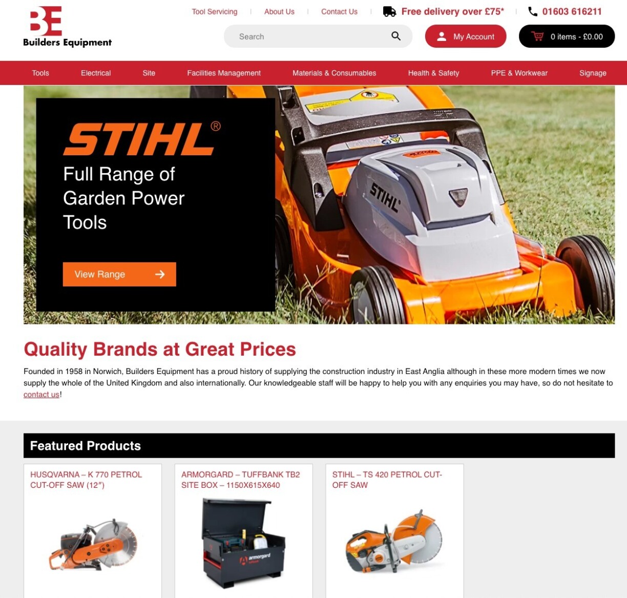
Make sure your website is easy to use.
5. Calls To Action (CTA)
The objective of most websites is to generate leads, sales and enquiries. A “Call to Action” (CTA) is what we want people to do - rather than let visitors browse the website aimlessly we use CTAs to steer them in the right direction. So:
- Does the website have clear Calls to Action?
Effective calls to action are a combination of eye-catching design and clear copy. A good website should invite you to do at least one thing straight away, from calling a number to visiting a specific offer.
Websites like Sainsbury's have great Calls to Action. Their homepage below shows the home page with several clear CTA buttons, so the customer knows what to do and how to get there.
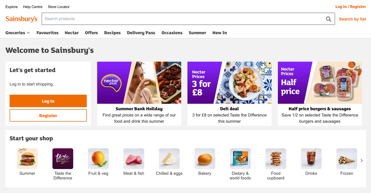
The Sainsbury's website has clear and stand out CTA's.
6. Search performance
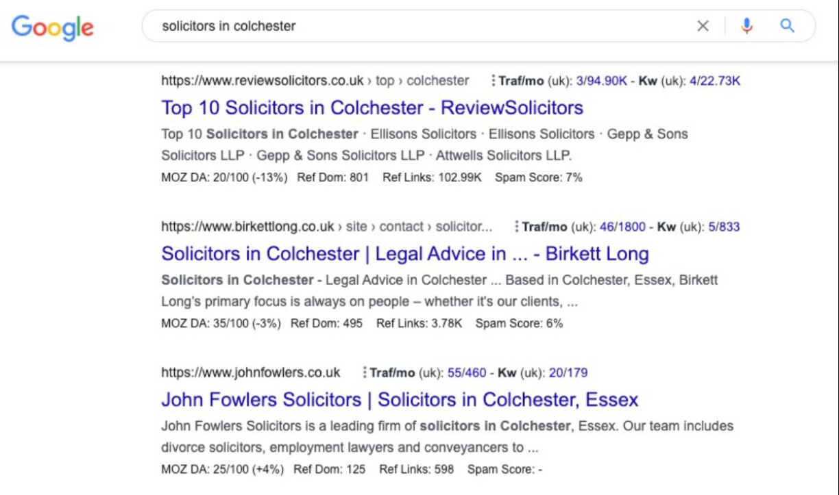
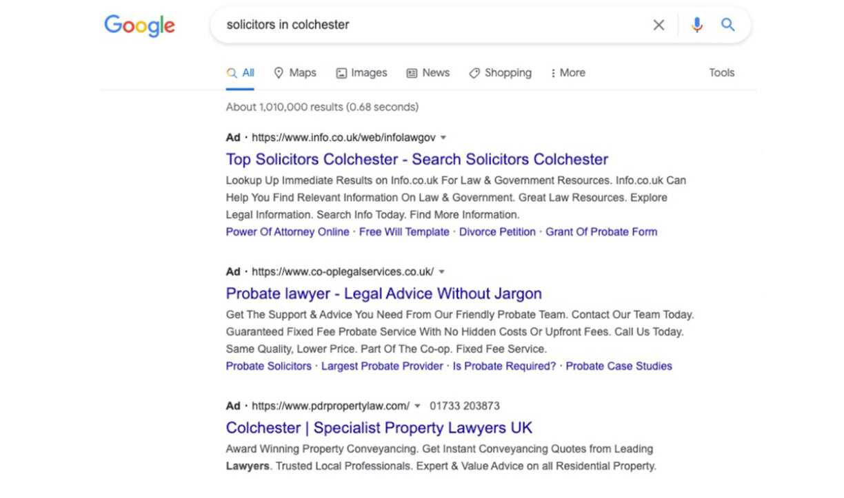
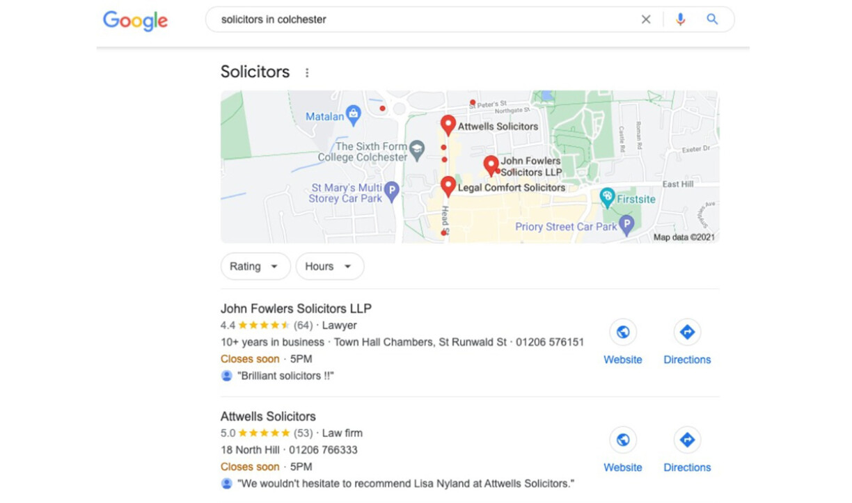
In this last step we are analysing how your competitor’s website performs in search engines. This may not always be relevant but most commercial websites require a healthy ranking for priority key words. You are looking at natural (organic) listings, Google Ads and Google My Business listings for this step.
Below is an example search result for “Solicitors in Colchester” which shows all three types of listing.
If competitors are appearing in several places on the first search page, then score them highly. This is all about visibility on Google to the potential customer. Competitor’s performance in search engines is worth scoring to see what you are up against when thinking about your own Search marketing.
Competitor website analysis may seem time consuming but it is definitely worth doing. Keep it manageable by looking at 5-10 websites and concentrate on what is good and what is bad about these sites by using your scoring system.
If you're creating a new website it's a good idea to build a competitor website analysis into your planning and website brief.
Remember, by analysing your competition, you are discovering weaknesses to exploit and good practices you can take and improve upon.
Need some help?
Bigfork help B2B companies improve the performance of their websites. Find out what we can do for you in our Website Consultancy download, or feel free to get in touch.
This article was published on , filed under strategy and planning.
The Forkcast
Not your average B2B newsletter. Spice up your inbox with The Forkcast.

