
What makes a good B2B SaaS website?
SaaS is a crowded market. Buyers spend hours online researching features, prices and comparing your product to competitors’.
This means your website does a lot of the selling, before sales even get involved. If it’s not designed to generate leads and get those demo enquiries, you’re losing a lot of potential customers.
So, what separates a good B2B SaaS website from an average one? Here are 6 ingredients that make a difference:
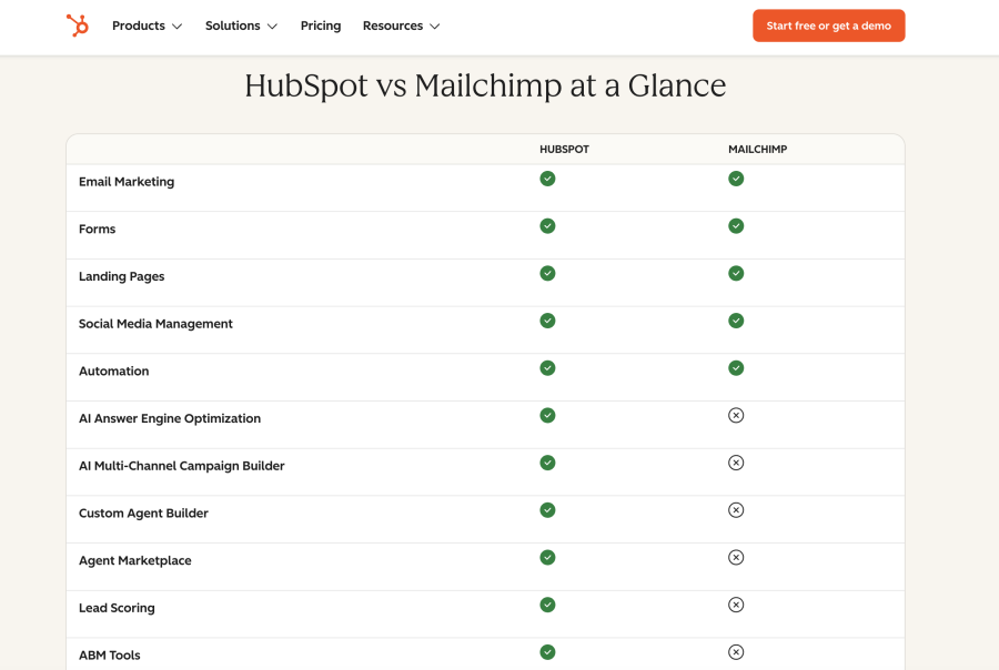
There are product comparison pages
B2B buyers will be searching for "your product vs competitor’s”, so you need a page to answer that question. A good comparison page is honest. It doesn't pretend you're the best fit for everyone.
It says what kind of company you’re built for, where you're different, and where a competitor might be the better choice for a different type of buyer. It’s honesty that builds trust with buyers and gets you the right kind of clients.
Hubspot have dedicated comparison pages for their main competitors.
Pricing is transparent
Transparent pricing is still a big debate among B2B companies. Some SaaS companies hide pricing behind a "contact us" form. Others put the number front and centre.
Hiding pricing can push buyers away. They won't book a call to ask your fees or book a demo before they know the cost. Spilling the beans on pricing also makes sure you get more of the right enquiries. If your customers are already happy with the cost before they get in touch, then they’re a more qualified lead.
However, if your pricing does depend on a conversation, say why it does, what factors are considered in the quote, and be clear about what an initial conversation involves.
Content speaks to the whole buying committee
B2B SaaS deals aren’t down to the decision of one person. Depending on your product, there’ll be finance, IT, sales, marketing, and maybe the legal department, who all need convincing.
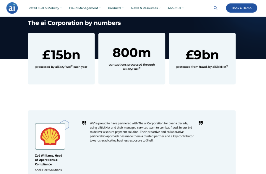
The ai Corporation does this well. Their site has a section written directly for compliance and legal, spelling out their PCI-DSS compliance and industry standards.
They speak to finance buyers with figures like ‘£9bn protected from fraud’, and their client testimonial is from a Head of Operations & Compliance, so it speaks to exactly the kind of person reading it.
If your website only has content appealing to one person, you’re relying on them to make a business case for you.
It's optimised for demo conversions
Getting a visitor to convert on a SaaS site comes down to more than a big "Book a demo" button. Every step a user takes before clicking that button counts to make a seamless conversion journey.
Some conversion rate optimisation tactics for SaaS companies include:
-
Keeping forms as short as possible. Get the essential information, and anything else can come from a discovery call.
-
Set expectations before somebody books a call or demo. Nobody wants to sign up for a 30-minute hard sell. Say how long the process takes, what they'll get from it, and what happens next. Be clear about what happens if they decide it's not for them too. Buyers are risk averse and want to avoid being tied into a contract.
-
Show the software in action. A video of the software does more than a long paragraph describing what is does.
Unique strengths are clear
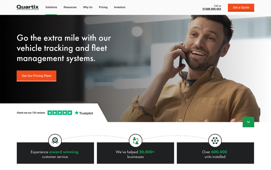
Not every SaaS company can compete on price or features. Sometimes your strongest card is something else entirely. Take Quartix, for example.
Quartix are a SaaS company who sell fleet management software. They knew from customer surveys that customer service was their real strength.
Instead of filling their key pages with software screenshots and tech benefits, they use photos of real people and lead with testimonials and five-star reviews.
It's a simple shift, but it shows customers a memorable difference. Changes like these are what increased their conversions by 300%.
Work out what you're best at, and don't bury it under feature lists. Put it where people will see it and remember it.
It's kept up to date
SaaS platforms and technology move fast. A good SaaS website should always keep up with what buyers want. If your product is updated, your website needs to reflect it. If buyers see the gap, it breaks trust.
Monthly website optimisation is the best way to keep a SaaS site updated and relevant. Small, regular content updates make sure your customers get an accurate view of what your software offers. Then ongoing SEO helps your site get found in search engines and ai.
To wrap up
There’s no single feature that makes a good SaaS website. It’s lots of intentional decisions, working together.
Tasty SaaS websites are the ones that get results: leads, bookings, and more customers.
Want to see how tasty your website is?
This article was published on .

The Forkcast
The Forkcast

Ready
to get
started?
We can make your new website a great success.